The challenge
Bloomwell had a strong formula and a forgettable brand. In a category crowded with pastel minimalism, they looked like everyone else, and their early online sales stalled because nothing told a shopper why this one, why now. They needed a position worth paying for, not just nicer packaging.
What we did
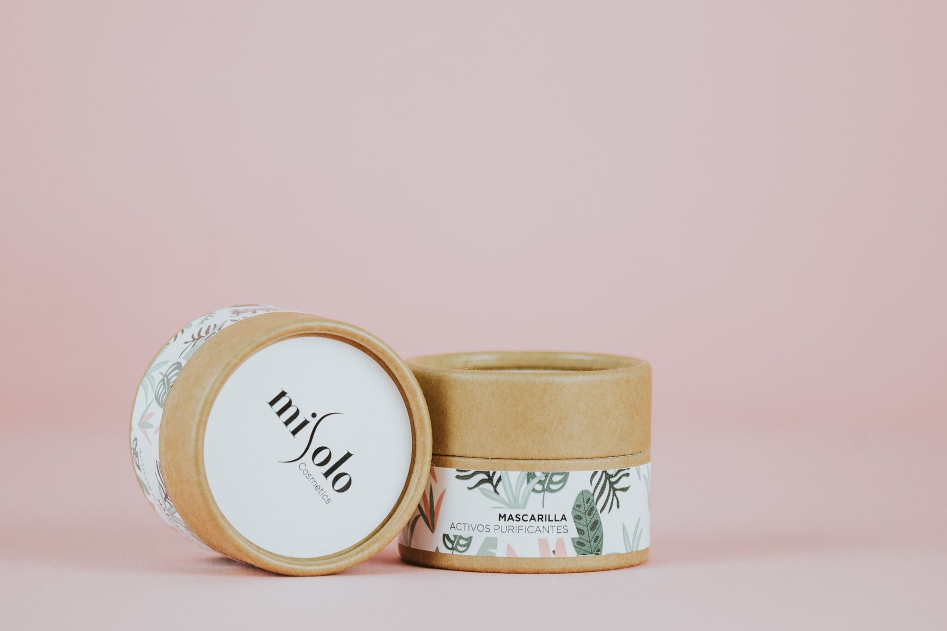
We ran a short strategy sprint to find a clearer space — calm, evidence-led skincare without the clinical coldness — then built an identity and packaging system around it. The website was redesigned to lead with that idea so a first-time visitor understood the brand in seconds, not minutes.
The result
The relaunch gave Bloomwell a brand the founders could finally talk about confidently, and a consistent look from the product in hand to the checkout page. The team reported a stronger response from retail partners they had previously struggled to interest.


“We always had the product. Cinder gave us the reason people remember us — and now everything from the jar to the website says the same thing.”
Co-founder, Bloomwell

Got a brand problem like this?
Let us take a look. The first call is free and honest.
Start a project→