The challenge
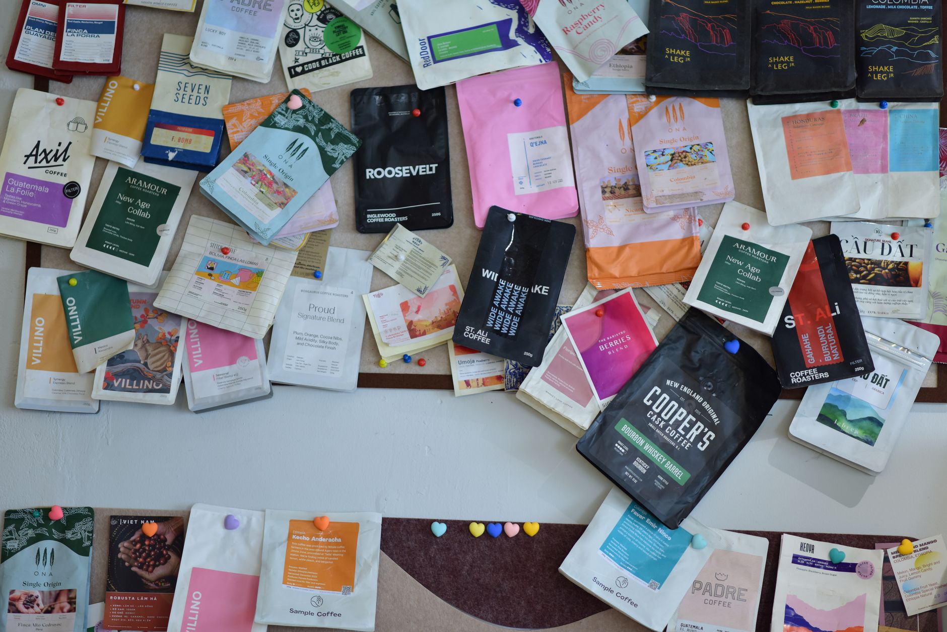
Brewline started as a weekend roast out of an HDB kitchen and grew faster than its branding. The old label was hand-made and warm but unreadable on a shelf, and three product lines all looked like different companies. As they moved into cafes and a supermarket trial, they needed to look like one brand a buyer could trust.
What we did
We built a single identity with a confident wordmark and a colour-coded system that let every roast sit together as a family while staying easy to tell apart. The packaging was redesigned around how people actually shop — origin and roast level legible at arm's length — and prepared to the printer's dieline so the first production run went smoothly.
The result
Brewline secured its supermarket listing on the strength of the new packaging and reported that wholesale enquiries became noticeably easier once the brand looked the part. The colour-coded system has since absorbed two new roasts without a redesign.
“For the first time our coffee looks as good as it tastes. Buyers take us seriously now, and we can launch a new roast without starting from scratch.”
Founder, Brewline
Got a brand problem like this?
Let us take a look. The first call is free and honest.
Start a project→